Author

admin

Browsing

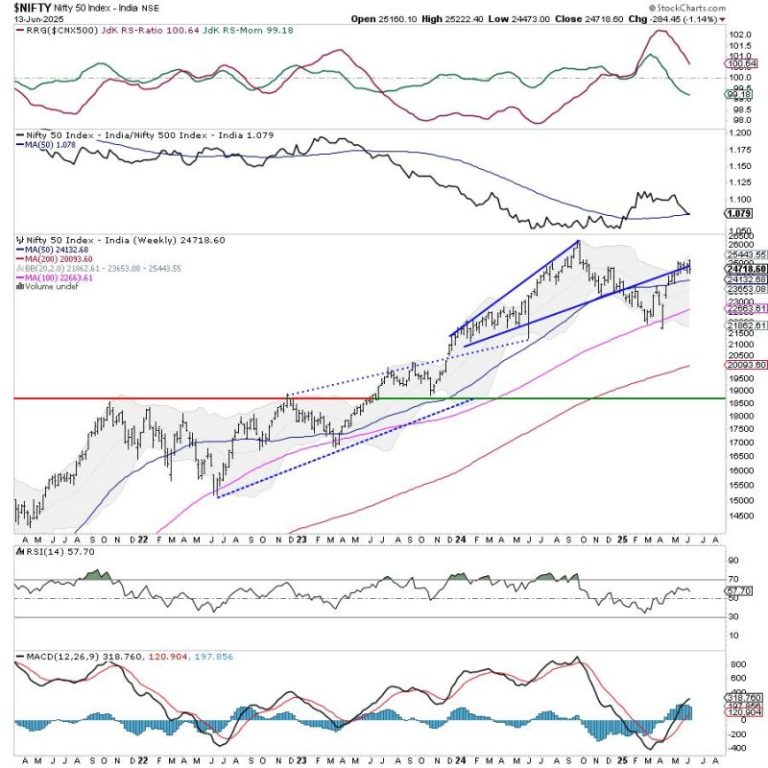
An attempt to break out of a month-long consolidation fizzled out as the Nifty declined and returned inside the trading zone it had created for itself. Over the past five sessions, the markets consolidated just above the upper edge of the trading zone; however, this failed to result in a breakout as the markets suffered a corrective retracement. The trading range stayed wider on anticipated lines; the Index oscillated in a 749-point range over the past week. The volatility rose; the India Vix climbed 3.08% to 15.08 on a weekly basis. The headline Index closed with a net weekly loss of 284.45 points (-1.14%).

We have a fresh set of geopolitical tensions to deal with Israel attacking Iran. The global equity markets are likely to remain affected, and India will be no exception to this. Having said this, the Indian markets are relatively stronger than their peers and are likely to stay that way. Despite the negative reaction to the global uncertainties, Nifty has shown great resilience and has remained in the 24500-25100 trading zone, in which it has been trading for over a month now. There are high possibilities that over the coming week, the Nifty may stay volatile and oscillate in a wide range, but it is unlikely to create any directional bias. A sustainable trend would emerge only after Nifty takes out 25100 on the upside or violates the 24500 level.

The levels of 25100 and 25300 are likely to act as resistance points in the coming week. The supports are likely to come in at 24500 and 24380.

The weekly RSI stands at 57.67; it stays neutral and does not show any divergence against the price. The weekly MACD is bullish and remains above its signal line.

The pattern analysis of the weekly chart shows that the Nifty has failed to break above the rising trendline resistance. This trendline begins from 21150 and joins the subsequent higher bottoms. Besides this, it reinforces the 25100 level as a strong resistance point. For any trending upmove to emerge, it would be crucial for the Index to move past this level convincingly.

Overall, it is unlikely that the Nifty will violate the 24500 levels. The options data shows very negligible call writing below 24500 strikes, increasing the possibility of this level staying defended over the coming days. Unless there is a situation with more gravity to be dealt with, the markets may stay largely in a defined trading range. The sector rotation stays visible in favor of traditionally defensive pockets and low-beta stocks. We continue to recommend a cautious stance as long as the Index does not move past the 25100 level and stays above that point. Until then, a highly stock-specific approach is recommended while guarding profits at higher levels.


Sector Analysis for the coming week

In our look at Relative Rotation Graphs®, we compared various sectors against the CNX500 (NIFTY 500 Index), representing over 95% of the free-float market cap of all the listed stocks. 

Relative Rotation Graphs (RRG) show that the Nifty Midcap 100 has rolled inside the leading quadrant and is set to outperform the broader markets relatively. The Nifty PSU Bank and PSE Indices are also inside the leading quadrant; however, they are giving up on their relative momentum.

The Nifty Infrastructure Index has rolled into the weakening quadrant. The Banknifty, Services Sector Index, Consumption, Financial Services, and Commodities Sector Indices are also inside the weakening quadrant. While stock-specific performance may be seen, the collective relative outperformance may diminish.

The Nifty FMCG Index languishes in the lagging quadrant. The Metal and Pharma Indices are also in the lagging quadrant, but they are improving their relative momentum against the broader Nifty 500 Index.

The Nifty Realty, Media, Auto, and Energy Sector Indices are inside the improving quadrant; they may continue improving their relative performance against the broader markets.


Important Note: RRG charts show the relative strength and momentum of a group of stocks. In the above Chart, they show relative performance against NIFTY500 Index (Broader Markets) and should not be used directly as buy or sell signals.  


Milan Vaishnav, CMT, MSTA

Consulting Technical Analyst

www.EquityResearch.asia | www.ChartWizard.ae

Binance Chain is the dominant blockchain for memecoin activity, as its trading volume has surpassed Solana. BNB Chain holds 45% of the total memecoin DEX volume while Solana and Ethereum are sitting on 25% and 20% respectively. Binance Chain Flips Solana In Memecoin Trading Volumes After months of memecoin trading volume dominance, activity levels on

The post Binance Chain Overtakes Solana In Memecoin Trading Volume appeared first on CoinGape.

Bitcoin is showing a price structure that resembles the market conditions leading up to the 2021 crash. Prominent trader Peter Brandt has pointed out that fundamentals often appear strongest at market tops. His comments come as analysts debate whether Bitcoin is repeating a similar pattern from the past. Bitcoin Price Structure Mirrors 2021 Distribution Zone

The post Peter Brandt Predicts Possible Bitcoin Crash Mirroring November 2021 Pattern appeared first on CoinGape.

Between June 9 and 13, sixty major Bitcoin-related (BTC) announcements were made by companies around the world, according to data shared by @btcNLNico on X. The Bitcoin Treasury Strategy is entering a rapid growth phase, with more firms adopting the leading cryptocurrency as part of their financial infrastructure. Over 2,500 BTC Added as New and

The post Bitcoin Treasuries Skyrocket With 60 New Announcements Within A Week appeared first on CoinGape.

The founder of Cardano, Charles Hoskinson has released fresh developments regarding the possible integration of XRP and other Ripple-associated assets on the Cardano network. This update was a direct response to a user who inquired on the inclusion of RealUSD (RLUSD) on Cardano. Hoskinson Hints at Comprehensive XRP Integration Package Hoskinson responded by highlighting a

The post Charles Hoskinson Provides Update On XRP’s Integration Into Cardano appeared first on CoinGape.

Peter Schiff has once again taken aim at Bitcoin (BTC) and its biggest corporate supporter, Strategy. In a recent post on X, formerly known as Twitter, the economist warned that the “biggest regret Strategy shareholders will have is not selling.” Peter Schiff Warns Strategy Shareholders of Looming Collapse Schiff, a longtime critic of Bitcoin, suggests

The post Peter Schiff Warns MSTR Shareholders As Strategy Doubles Down On Bitcoin appeared first on CoinGape.

U.S. President Donald Trump said on Friday that concerns over national security risks posed by Nippon Steel’s $14.9 billion bid for U.S. Steel can be resolved if the companies fulfill certain conditions that his administration has laid out, paving the way for the deal’s approval.

Shares of U.S. Steel rose 3.5% on the news in after-the-bell trading as investors bet the deal was close to done. Trump, in an executive order, said conditions for resolving the national security concerns would be laid out in an agreement, without providing details. “I additionally find that the threatened impairment to the national security of the United States arising as a result of the Proposed Transaction can be adequately mitigated if the conditions set forth in section 3 of this order are met,” Trump said in the order, which was released by the White House.

The companies thanked Trump in a news release, saying the agreement includes $11 billion in new investments to be made by 2028 and governance commitments including a golden share to be issued to the U.S. government. They did not detail how much control the golden share would give the U.S. Shares of U.S. Steel had dipped earlier on Friday after a Nippon Steel executive told the Japanese Nikkei newspaper that its planned takeover of U.S. Steel required “a degree of management freedom” to go ahead after Trump earlier had said the U.S. would be in control with a golden share.

The bid, first announced by Nippon Steel in December 2023, has faced opposition from the start. Both Democratic former President Joe Biden and Trump, a Republican, asserted last year that U.S. Steel should remain U.S.-owned, as they sought to woo voters ahead of the presidential election in Pennsylvania, where the company is headquartered.

Biden in January, shortly before leaving office, blocked the deal on national security grounds, prompting lawsuits by the companies, which argued the national security review they received was biased. The Biden White House disputed the charge.

The steel companies saw a new opportunity in the Trump administration, which began on January 20 and opened a fresh 45-day national security review into the proposed merger in April.

But Trump’s public comments, ranging from welcoming a simple “investment” in U.S. Steel by the Japanese firm to floating a minority stake for Nippon Steel, spurred confusion.

At a rally in Pennsylvania on May 30, Trump lauded an agreement between the companies and said Nippon Steel would make a “great partner” for U.S. Steel. But he later told reporters the deal still lacked his final approval, leaving unresolved whether he would allow Nippon Steel to take ownership.

Nippon Steel and the Trump administration asked a U.S. appeals court on June 5 for an eight-day extension of a pause in litigation to give them more time to reach a deal for the Japanese firm. The pause expires Friday, but could be extended.

June 18 is the expiration date of the current acquisition contract between Nippon Steel and U.S. Steel, but the firms could agree to postpone that date

This post appeared first on NBC NEWS

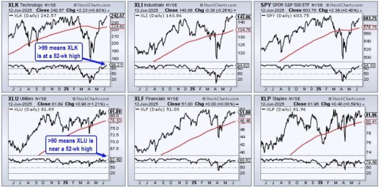
Three sectors stand out, with one sporting a recent breakout that argues for higher prices. Today’s report will highlight three criteria to define a leading uptrend. First, price should be above the rising 200-day SMA. Second, the price-relative should be above its rising 200-day SMA. And finally, leaders should trade at or near 52-week highs. Let’s compare the Utilities SPDR (XLU) to see how it stacks up.

The CandleGlance charts below show the top five sectors and SPY. I am ranking performance using Fast Stochastics (255,1). Stochastic values reflect the level of the close relative to the high-low range over the given period. 255 trading days is around 1 year. An ETF is at a 52-week high when the value is above 99 (XLK) and an ETF is near a new high with a value above 90 (XLU). The CandleGlance charts show XLK, XLI and XLU with values above 90, which means the are near new highs.

***********************

TrendInvestorPro is following the breakout in XLU, the bull flag in GLD, a small wedge in AMLP, a breakout in XLP and more. We also covered trailing stop alternatives for the pennant breakouts in some key tech related ETFs. Take a trial and get three free bonus reports.

***********************

Now let’s turn to price action. XLU is trading above its rising 200-day SMA. Thus, the long-term trend is up. XLU also broke falling channel resistance in early May. The pink lines show a falling channel that retraced around 61.8% of the July-December advance (23.6%). Both the pattern and the retracement amount are typical for corrections within a bigger uptrend. The early May breakout signals a continuation of the long-term uptrend and new highs are expected. The May lows mark first support at 78. A close below this level would warrant a re-evaluation.

And finally, let’s measure relative performance using the price-relative (XLU/RSP ratio). The lower window shows the price-relative in an uptrend for over a year and above its 200-day SMA since early March. This shows long-term relative strength. The pink trendlines show relative performance corrections when XLU underperformed for short periods. XLU is currently experiencing an underperformance correction because the broader market surge from early April to early June.

TrendInvestorPro is following the breakout in XLU, the bull flag in GLD, a small wedge in AMLP, a breakout in XLP and more. We also covered trailing stop alternatives for the pennant breakouts in some key tech related ETFs. Click here to learn more and gain immediate access.

//////////////////////////////////////////////////

Catching a sector early as it rotates out of a slump is one of the more reliable ways to get ahead of an emerging trend. You just have to make sure the rotation has enough strength to follow through.

On Thursday morning, as the markets maintained a cautiously bullish tone, I checked the New Highs panel on the StockCharts Dashboard, scanning the 1-, 3-, 6-, and 9-month highs list. A clear theme emerged—biotech and healthcare stocks dominated the shorter-term highs.

Seeing strength in healthcare and biotech, I checked the Market Summary BPI panel to compare breadth across sectors. Healthcare posted a 63.93% reading—an early sign the sector may be turning higher.

Comparing the broader sector with the biotech industry, the Key Ratios – Offense vs. Defense panel showed that Biotech outperformed Healthcare by a modest 2.31% over the past three months. This panel compares the SPDR S&P Biotech ETF (XBI), which represents the biotech sector, with the broader Health Care Select Sector SPDR Fund (XLV).

Are Biotech and Healthcare Starting a Bullish Rotation?

So, are we seeing an early rotation of both industry and sector toward the upside, and could either be shaping up as an opportunity for investment? Let’s take a comparative look at both relative to the SPDR S&P 500 ETF (SPY), our broad market stand-in.

Comparing XBI and XLV to SPY: Signs of Leadership?

FIGURE 1. PERFCHARTS OF XBI, XLV, AND SPY. This is typical of what you’d see during an early-stage rotation.

This PerfCharts view shows a one-year snapshot of relative performance, with biotech lagging behind healthcare, and both trailing the SPY in negative territory. Yet XBI and XLV are showing signs of recovery, with XBI exhibiting a sharper angle of ascent.

Seasonal Strength in Healthcare and Biotech Stocks

Now here’s an interesting addition to the current analysis: what if we considered the industry and the sector from a seasonality perspective? The reason for this is that certain sectors and the industries within them tend to exhibit recurring patterns of strength or weakness during specific times of the year. If we’re seeing a potential turning point in either, could a seasonality lens offer additional insight or clarity to the analysis?

Biotech Seasonality: Strong Months for XBI

Let’s start with XBI, and notice how it’s now entering a cluster of seasonally-favorable months.

FIGURE 2. SEASONALITY CHART OF XBI. The industry is entering a cluster of seasonally strong months.

According to this 10-year seasonality chart, June, July, August, and November tend to be strong months for XBI, with positive closing rates well above 50% (see figures above each bar) and higher-than-average returns (see figures at the bottom of the bars). Among them, June and November stand out as XBI’s strongest seasonal months.

XLV Seasonality: November Still Reigns

FIGURE 3. SEASONALITY CHART OF XLV.  According to this, July is XLV’s second-strongest month after November.

XLV’s seasonal profile shares a similar pattern, with a few key differences. July emerges as XLV’s second-strongest month, boasting a close rate of 89% and an average return of 3.1%. Like XBI, November is XLV’s top month in terms of average return.

What this tells us is that the biotech industry and the broader healthcare sector have historically performed well during these periods (especially November), suggesting that seasonal strength could serve as a tailwind if the current rotation continues to build momentum.

Charting the Rotation: XBI Trend Structure Shows Some Clarity

Next, let’s take a look at their current price action, starting with a daily chart of XBI.

FIGURE 4. DAILY CHART OF XBI. Notice how the trend structure is well-defined by the Fibonacci retracement, providing clear measurements for you to gauge the subsequent directionality once the market decides which way XBI will go.

XBI’s price action shows it reversed at the 50% Fibonacci Retracement level (November high to April low). Will the bears take control, or will XBI’s near-term reaction strengthen into an uptrend, eventually pushing XBI past the 61.8% retracement level, a threshold wherein bears may fold their positions and bulls increase theirs?

In light of the latter, the Relative Strength Index (RSI) is at 61 and rising, indicating room for upside, but only under the condition that the current bullish swing maintains its trajectory.

A few actionable tips. If you’re bullish on XBI and planning to add it to your portfolio, consider the following:

  • If XBI were to pull back deeper, watch to see if it bounces near the last recent swing low area at $76.
  • If XBI reverses to the upside, expect resistance at the 61.8% Fib retracement at around $91. Also, watch the yellow-shaded zone around $94, an area of concentrated trading activity which may also act as a strong resistance zone.

If XBI rotates in a bullish fashion, these key levels can help guide your analysis.

XLV Technical Setup: Strength, But Not Yet a Breakout

Next, shift over to a daily chart of XLV. You’ll notice it’s quite different despite also exhibiting a recovery.

FIGURE 5. DAILY CHART OF XLV. Unlike the previous example, XLV’s price action is more muddled.

XLV’s recovery doesn’t appear as convincing just yet, as it still needs to clear multiple swing highs and resistance levels clustered between $139 and $141 (highlighted in green). If it manages to break above this zone, the next resistance range—shaded in yellow—sits between $148 and $150. In short, the sector proxy faces several hurdles and technical headwinds ahead.

The RSI, at 58 and rising, is nowhere near overbought territory, but it may not immediately indicate bullishness unless XLV is able to establish an uptrend. For now, it isn’t clear if that will happen, so exercise caution.

From an actionable standpoint, the current technical structure doesn’t offer a clear entry setup. That’s largely because the trend lacks a well-defined sequence of higher swing highs and higher swing lows—something you’d typically look for when establishing favorable entry and exit positions.

At the Close

If healthcare and biotech are starting to rotate higher, XBI and XLV are the charts to watch. XBI shows a stronger trend structure, while XLV still faces resistance.  With seasonality on their side, add them to your ChartLists to track key levels and price action.


Disclaimer: This blog is for educational purposes only and should not be construed as financial advice. The ideas and strategies should never be used without first assessing your own personal and financial situation, or without consulting a financial professional.

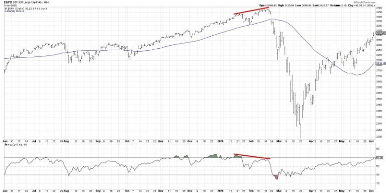
With Friday’s pullback after a relatively strong week, the S&P 500 chart appears to be flashing a rare but powerful signal that is quite common at major market tops. The signal in question is a bearish momentum divergence, formed by a pattern of higher highs in price combined with lower peaks in momentum, which indicates weakening buying power after an extended bullish phase.

Today, we’ll share a brief history lesson of previous market tops starting with the COVID peak in 2020. And while we don’t necessarily see a sudden downdraft as the most likely outcome, this bearish price and momentum structure suggests limited upside for the S&P 500 until and unless this divergence is invalidated.

First, let’s review some classic market tops, see how divergences are formed, and learn what often comes next.

The year 2020 started in a position of strength, continuing the uptrend phase of 2019. But conditions soon deteriorated, with weaker momentum and breadth signals flashing cautionary patterns. In the chart below, we can see the higher highs and higher lows in price action in January and February 2020.

Notice how the RSI was overbought at the January peak but not overbought at the February top? This pattern of higher prices on weaker momentum is what we’re looking for, as it implies a lack of buying power and therefore limited upside.

Almost two years later, the market had been driven higher due to an unprecedented amount of liquidity injected into the financial system. Toward the end of 2021, however, we saw the familiar bearish divergence flash again.

Here, we can see the higher price highs in November 2021 through January 2022 were marked by lower readings on momentum indicators like RSI. It’s worth noting here that these divergences don’t happen in a vacuum. In other words, we can use other tools in the technical analysis toolkit to evaluate the trend and determine if the price is reacting as expected to the bearish divergence.

In the weeks after the 2022 peak, we can see that the price broke down through an ascending 50-day moving average. The RSI eventually broke below the 40 level, confirming the rotation from a bullish phase to a bearish phase. So while the divergence itself does not imply a particular path in the months after the signal, it alerts us to use other indicators to validate and track a subsequent downtrend move.

More recently, the February 2025 market peak featured some classic momentum patterns going into the eventual top.

Starting in August 2024, we can see a series of higher price highs that were accompanied by improving RSI peaks. As the price was moving higher, the stronger momentum readings confirmed the uptrend phase. Then, starting December 2024, the next couple price peaks were marked with weaker momentum readings. This bearish divergence with price and RSI once again signaled waning momentum going into a major market peak.

That brings us to the current S&P 500 chart, featuring yet another bearish momentum divergence. And based on what we’ve reviewed so far, you can probably understand why I’m a bit skeptical going into next week!

To be fair, I’ve highlighted price and momentum divergences from significant market tops, many of which came after extended bull market phases. In this case, we’re still only two months off a major market low. However, I would argue the basic premise still holds true. With Friday’s pullback, the S&P 500 appears to be flashing this same pattern of higher prices on weaker momentum. Considering this negative rotation on momentum, I would anticipate at least a retest of the May swing low around 5770.

What would change this tactical bearish expectation? The only way for a bearish divergence to be negated is for the price to continue higher on stronger momentum. So, until we see the price make a new peak combined with the RSI pushing back up to overbought levels, a pullback may be the most likely scenario in the coming weeks.

RR#6,

Dave

P.S. Ready to upgrade your investment process? Check out my free behavioral investing course!


David Keller, CMT

President and Chief Strategist

Sierra Alpha Research LLC

marketmisbehavior.com

https://www.youtube.com/c/MarketMisbehavior


Disclaimer: This blog is for educational purposes only and should not be construed as financial advice. The ideas and strategies should never be used without first assessing your own personal and financial situation, or without consulting a financial professional.

The author does not have a position in mentioned securities at the time of publication. Any opinions expressed herein are solely those of the author and do not in any way represent the views or opinions of any other person or entity.