Archive

April 19, 2025

Browsing

Stocks vs. bonds? In this video, Julius breaks down the asset allocation outlook and why defensive sectors, large-cap value, and bonds may continue to outperform in this volatile market. He starts at the asset allocation level using Relative Rotation Graphs (RRGs) to analyze stocks vs bonds performance, then highlights the ongoing defensive sector rotation, and identifies strength in large-cap value stocks.

To close out the show, Julius dives into stock-specific opportunities based on the relative rotation of sector constituents, pointing to potential leadership shifts as market volatility rises.

This video was originally published on April 17, 2025. Click on the icon above to view on our dedicated page for Julius.

Past videos from Julius can be found here.

#StayAlert, -Julius

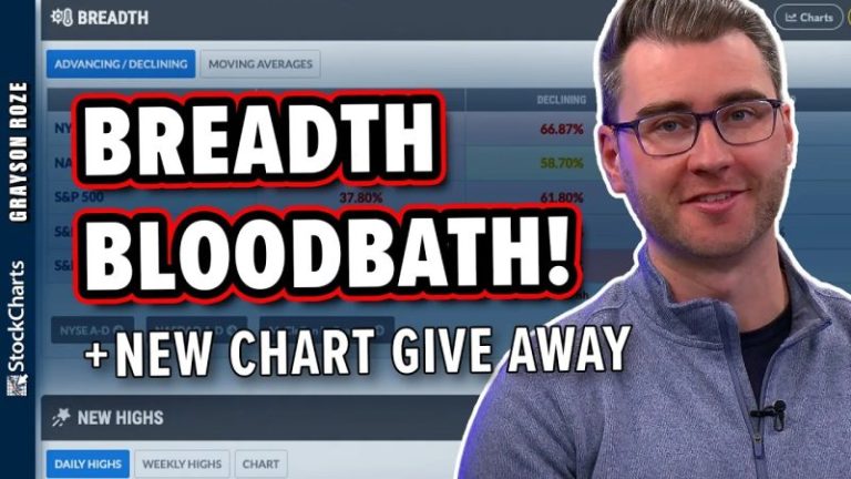
In this video, Grayson unveils StockCharts’ new Market Summary ChartPack—an incredibly valuable new ChartPack packed full of pre-built charts covering breadth, sentiment, volatility data and MUCH MORE!

From there, Grayson then breaks down what he’s seeing on the current Market Summary dashboard, illustrating how he’s putting this invaluable tool to work in the current climate. He highlights weakness in Small Cap stocks, uses the Factors Map to pinpoint the groups that investors are gravitating to, and explains why the sea of red across the breadth maps continues to be a clear indication of the weakness in this market.

This video originally premiered on April 18, 2024. Click on the above image to watch on our dedicated Grayson Roze page on StockCharts TV.

You can view previously recorded videos from Grayson at this link.

It was another erratic week in the stock market. There were several market-moving events sprinkled throughout this short trading week, including earnings, escalation of tariff wars, and Chairman Jerome Powell’s remarks at the Economic Club of Chicago. This extended to wild swings in the bond market as well.

We had several positive earnings from banks and Netflix, Inc. (NFLX). Others, such as UnitedHealth Group, Inc. (UNH), disappointed, sending the Dow Jones Industrial Average ($INDU) lower by 1.33%.

Chairman Powell stated that tariffs could increase inflation. This would cause economic growth to slow down and unemployment to increase. The hope is that inflation is transitory, and, after it becomes stable, the Fed can continue to focus on its dual mandate of maximum employment and price stability.

It’s an insecure time for investors, and many feel the pain. You’re probably wondering how long this pain will go on for. In an uncertain environment, the best you can do is turn to the bond market.

It’s All About Bonds

The recent wild swinging market activity can be encapsulated in the price action of Treasury yields. Since 2024, yields have been swinging up and down. In the past year, the 10-year Treasury yield has ranged from 3.60% to 4.81%, and when the range is this wide, it’s an indication of economic instability. Not to mention, economic instability could result in a weaker economy.

The daily chart of the 10-Year US Treasury Yield Index ($TNX) gives you an idea of the range of yields in the last year. More recently, the yield has risen from 3.89% to 4.59%, and has now pulled back to its 50-day simple moving average (SMA).

FIGURE 1. DAILY CHART OF 10-YEAR TREASURY YIELDS. Yields have been seeing some large up and down swings.Chart source: StockCharts.com. For educational purposes.

Generally, when stock prices fall, bond prices rise. Since bond yields move inversely to bond prices, you’d expect yields to fall. This scenario isn’t playing out. Instead, we’re seeing yields move erratically while bond prices remain suppressed. There needs to be stability in bond yields before a stock market recovery, and one way to do that is to monitor the chart of the Merrill Lynch Option Volatility Estimate, referred to as the MOVE Index ($MOVE).

The MOVE Index tracks bond volatility. Think of it as the bond counterpart to the Cboe Volatility Index ($VIX). The chart below displays the $MOVE/$VIX relationship, with the correlation between the two in the lower panel.

FIGURE 2. THE MOVE INDEX VS. VIX. A high correlation between the MOVE Index and VIX suggests interest rates and stock prices are tightly connected. A lower correlation would indicate stability in equities.Chart source: StockCharts.com. For educational purposes.

The two have been highly correlated since the end of March, which indicates that stocks and interest rates are tightly connected. This means the wild up and down swings in equities could continue. When the two are less correlated, we can expect equities to start settling down. Looking at the above chart, a correlation of 0.80 would be sufficient for signs of stability.

Both $VIX and $MOVE have come back slightly, but their correlation is at 0.93, which is relatively high.

Be sure to save both charts displayed in this article to your ChartLists. They could alert you to stability in the stock market ahead of other indicators.

The Bottom Line

Until stability returns, you could do the following:

  • Stay on the sidelines and keep some dry powder.
  • Invest in risk-off instruments such as gold and silver.
  • Park some of your money in defensive sectors.

Equities could slide lower before stability returns. If this happens, you could pick up some growth stocks for a bargain.

An empowered investor comes out ahead after market instability. So monitor the market closely and, when the time is right, make wise investment decisions.

End-of-Week Wrap-Up

  • S&P 500 down 1.50% on the week, at 5282.70, Dow Jones Industrial Average down 2.66% on the week at 39,142.23; Nasdaq Composite down 2.62% on the week at 16,286.45.
  • $VIX down 21.06% on the week, closing at 29.65.
  • Best performing sector for the week: Energy
  • Worst performing sector for the week: Consumer Discretionary
  • Top 5 Large Cap SCTR stocks: Palantir Technologies, Inc. (PLTR); Elbit Systems, Ltd. (ESLT); Anglogold Ashanti Ltd. (AU); Just Eat Takeaway.com (JTKWY); Kinross Gold Corp. (KGC)

On the Radar Next Week

  • Earnings season continues with Haliburton (HAL), Tesla (TSLA), Boeing Co. (BA), International Business Machines (IBM) and others reporting.
  • 30-Year Mortgage Rates
  • March New Home Sales and Building Permits
  • April S&P PMI
  • April Consumer Sentiment
  • Fed speeches from Jefferson, Harker, Kashkari, and others.

Disclaimer: This blog is for educational purposes only and should not be construed as financial advice. The ideas and strategies should never be used without first assessing your personal and financial situation, or without consulting a financial professional.

Reflecting on the price action over this shortened holiday week, I’m struck by how the leadership trends have not really changed too much. We’ve observed bombed-out market breadth indicators, and the S&P 500 remains clearly below its 200-day moving average despite a strong upside swing off the early April market low.

But how much as the leadership of this market changed over the last couple weeks? I would argue that conditions remain fairly consistent over that period, and are still not overwhelmingly bullish.

Defensive Sectors Still Outperforming Offense

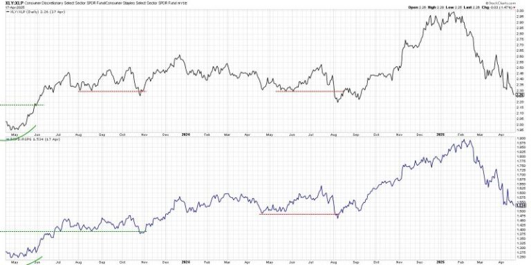
Here’s one of my favorite charts for analyzing offense vs. defense, a chart that holds a place of honor on my Market Misbehavior LIVE ChartList. We’re comparing the Consumer Discretionary and Consumer Staples using both cap-weighted and equal-weighted ETFs.

When the ratios are going higher, investors are favoring “things you want” over “things you need”, which implies optimism for economic growth. When the ratios slope lower, that suggests more defensive positioning as investors are skeptical of growth prospects.

We can see that the cap-weighted version of this ratio made a peak in January, while the equal-weighted version made its own top in February. Both ratios have been in a fairly consistent downtrend of lower highs and lower lows, even through last week’s sudden spike on tariff policy changes.

How bullish do I want to be when these ratios are sloping lower? Generally speaking, I’ve found that until investors start believing in the upside potential of Consumer Discretionary over the relative defense of Consumer Staples, it’s best to remain on the sidelines.

Using the RRG to Visualize Offense vs. Defense

While I often refer to relative strength ratios of sector ETFs vs. the S&P 500 index, I also enjoy leveraging the power of Relative Rotation Graphs (RRG®) to monitor a series of relative strength ratios in one simple but powerful visualization.

Here, I’m showing the 11 S&P 500 economic sectors relative to the S&P 500, and I’m highlighting Consumer Discretionary and Consumer Staples to monitor their relative positions. If you click “Animate” for this visualization, you’ll see that toward the end of 2024, offense was clearly outperforming defense. The XLY was in the Leading quadrant, the XLP was in the Lagging quadrant, and the rotations suggested a classic bull market configuration.

Fast-forward to February and March and you’ll see how Consumer Discretionary rotated into the Weakening and then Lagging quadrant. Meanwhile, Consumer Staples strengthened during that same period. At this point, the RRG is telling me defense over offense, in a classic bearish configuration.

Sticking With Groceries, Guns, and Gold

So, given the bearish leadership configuration in spite of a sudden bounce of the April market low, where can we find potential opportunities? I’ll highlight three ideas that I’ll summarize as “Groceries, Guns, and Gold.”

Playing off the “things you need” theme implied above, grocery retailer Kroger Co. (KR) has managed to pound out a fairly consistent pattern of higher highs and higher lows. With improving momentum and a new 12-month relative high this week, this is a chart continuing in a clear uptrend despite broad market weakness.  By the way, KR was one of the Top Ten Charts for April 2025 I presented with Grayson Roze!

Defense stocks like Northrop Grumman Corp. (NOC) have experienced an upside resurgence given geopolitical instability in 2025. From a technical perspective, I love how charts like NOC have rallied since mid-February, while most stocks, as well as our equity benchmarks, have been trending lower! There’s a significant resistance level to overcome around $550, but a confirmed break higher could open the door to further gains.

Gold has experienced an incredible run so far in 2025, finishing the week up 26% for the year compared to the S&P 500’s 10% loss over the same period. Similar to the chart of NOC, Newmont Corporation (NEM) is addressing a key resistance level from a major high in October 2024. But, so far in 2025, NEM has been scoring higher highs and higher lows, potentially building momentum for a break to a new all-time high.

It can be super tempting to consider the April low as “the bottom” and go all-in on growth stocks and offensive plays. But, given the lack of leadership rotation in April, I’m inclined to stick with charts that remain in strong uptrends during uncertain times.

RR#6,

Dave

P.S. Ready to upgrade your investment process? Check out my free behavioral investing course!


David Keller, CMT

President and Chief Strategist

Sierra Alpha Research LLC


Disclaimer: This blog is for educational purposes only and should not be construed as financial advice. The ideas and strategies should never be used without first assessing your own personal and financial situation, or without consulting a financial professional.

The author does not have a position in mentioned securities at the time of publication. Any opinions expressed herein are solely those of the author and do not in any way represent the views or opinions of any other person or entity.

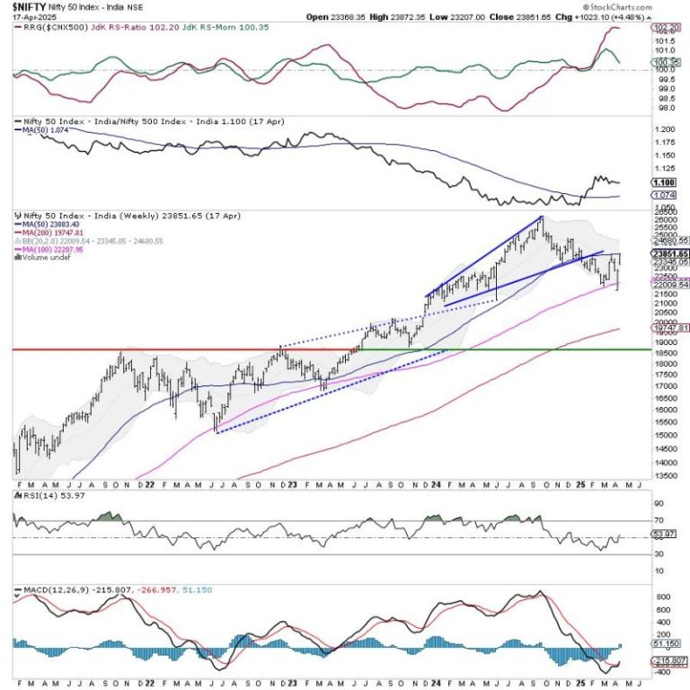
The week that went by was a short trading week with just three trading days. However, the Indian equities continued to surge higher, demonstrating resilience, and the week ended on a positive note. In the week before this one, the Nifty was able to defend the 100-week MA; last week, it surged higher and closed just at the 50-week MA. The trading range got narrower; the Index oscillated in a 665.35-point range. The volatility, too, cooled off; the India Vix declined by 23.08% to 15.47. While staying largely stable with a strong underlying bias, the headline Index closed with a net weekly gain of 1023.10 points (+4.48%).

There are a few technical levels that need to be closely observed. The Nifty resisted the 100-day moving average (DMA) at 23395 before breaking out above that level. Zooming out to the weekly chart, the Nifty has closed at the 50-week MA, currently placed at 23885. This point and the 200-DMA at 24050 create an important resistance zone for the Nifty. While there is room for Nifty to move higher towards the 24000 level, there are strong possibilities of the markets consolidating between the 23900 and 24000 levels. While no major drawdowns are expected, there is a high chance that the upmove may at least take a breather around this level. It is important to watch Nifty’s behavior against this level.

The coming week may start on a stable note; the levels of 24,000 and 24,210 are likely to act as resistance points. The support will come lower at 23500 and then at 23345, which is the 20-week MA.

The weekly RSI is 53.94; it has formed a 14-period high, indicating a bullish trend. The weekly MACD has shown a positive crossover; it is now bullish and trades above its signal line.

The pattern analysis on the weekly chart shows that the Nifty has returned to the important level of the 50-week moving average, which it previously violated when it initiated its corrective move. This level and the 200-DMA placed at a short distance at 24050 are likely to offer resistance. This would mean that the markets are entering a major resistance zone; unless 24050 is taken out on the upside, we can expect the markets to consolidate, showing minor retracements over the coming days.

Overall, it is time for one to focus on protecting the gains at higher levels. While one may continue staying invested on the long side, new purchases must focus on the pockets that have shown the improvement of relative strength at lower levels and show strong signs of reversing their trend. Effective rotation into sectors that show improvement in their relative strength and protecting gains in the pockets that have run up hard would be important. A cautiously positive outlook is advised for the coming week.


Sector Analysis for the coming week

In our look at Relative Rotation Graphs®, we compared various sectors against CNX500 (NIFTY 500 Index), which represents over 95% of the free float market cap of all the stocks listed.

Relative Rotation Graphs (RRG) show the Nifty PSU Bank and Consumption sector Index has rolled inside the leading quadrant. The Commodities, Financial Services, Banknifty, Infrastructure, and Metal Index are also placed inside the leading quadrant. While the Metal Index is showing a weakening of relative momentum, these groups are likely to relatively outperform the broader Nifty 500 index.

There are no sectors inside the weakening quadrant.

The Pharma Sector Index has rolled inside the lagging quadrant. The IT index also continues to languish inside this quadrant, along with the Midcap 100 index. The  Realty and the Media Indices are also inside the lagging quadrant; however, they are seen sharply improving their relative momentum against the broader markets.

The Nifty PSE, Energy, and FMCG Indices are inside the improving quadrant; they are expected to continue improving on their relative performance over the coming week.


Important Note: RRG charts show the relative strength and momentum of a group of stocks. In the above Chart, they show relative performance against NIFTY500 Index (Broader Markets) and should not be used directly as buy or sell signals.  


Milan Vaishnav, CMT, MSTA

Consulting Technical Analyst

www.EquityResearch.asia | www.ChartWizard.ae

Legendary trader Peter Brandt has once again caught the investors’ attention with his bearish prediction for XRP price. The veteran trader has made a series of predictions recently for the S&P 500, gold, Yen, Bitcoin, and Crude oil. However, it appears that he has shared bearish forecasts for both cryptocurrencies while remaining optimistic about the gold price’s future.

Peter Brandt Predicts 50% XRP Price Crash By This Time

XRP value today has surged about 1% to $2.08, accompanied by a falling trading volume of 29% to $1.7 billion. Notably, the crypto has consolidated between the $2.10 and $2.06 mark over the last 24 hours, indicating that the investors are staying neutral. Besides, CoinGlass data showed that Ripple’s Futures Open Interest stayed near the flatline, further reflecting the cautious stance of the traders.

However, amid the consolidation phase, analysts have shared mixed thoughts on the future trajectory of the coin. For context, renowned trader Peter Brandt has recently shared a gloomy forecast for Ripple’s native asset, which has fueled market speculations.

In a recent series of posts on social media, the trader has shared predictions for several items. For context, Brandt said that “everyone’s favorite” XRP price is likely to stay at its current level by to end of the year 2025.

However, he also noted that if the bears continue to dominate, the year could end on a further low note with its market cap falling to $60 billion. This represents a drop of over 50% in its market cap from the current level of $121.6 billion, indicating a price drop to $1.

Source: Peter Brandt, X

Despite that, recent trends indicate a strong run for Ripple’s coin in July. Notably, this anticipation is further cemented by the historical performances of the altcoins in the same month of prior years, which showed a strong growth in the assets.

Brandt Remains Bearish On BTC But Eyes Gold Price Rally

Apart from XRP price, Peter Brandt has also shared a prediction for Bitcoin price, citing “charts.” According to the veteran trader, BTC is likely to end the year at around $84,000, refuting claims of any robust breakout ahead.

Source: Peter Brandt, X

However, it contradicts other experts’ forecasts as many expect a strong breakout for the flagship crypto to a new all-time high ahead. For context, Robert Kiyosaki has recently said that BTC is poised to hit $1 million in the next few years, sparking market optimism.

Meanwhile, despite Brandt’s bearish outlook for Bitcoin and XRP price, he has shared a positive prediction for the Gold price. According to him, Gold is likely to hit $3,500 by the end of 2025. Sharing the update for the precious metal, he said, “Gold Finger, the market with the magic touch.”

The post Peter Brandt Predicts 50% Crash For ‘Everyone’s Favorite’ XRP Price appeared first on CoinGape.

Bullish momentum is building around the Solana price after rising by nearly 4% in the last 24 hours to trade at a three-week high of $139. This rally has obliterated a $1 million sell wall, with traders now wondering how high SOL will rally and whether the $150 price level is next. 

Solana Price Rallies As It Obliterates $1M Sell Wall 

Solana price is recovering after breaking past a key resistance zone at around $138. This rally led to liquidations of $1M, as depicted by the SOL liquidation heatmap. After clearing this sell wall, SOL now looks primed to bounce to $150 if buyers maintain control. 

SOL Liquidation Heatmap

Data from Coinglass further shows that the recent surge in buying pressure around Solana also occurred after more than $13M in short liquidations. The closure of these short positions caused a spike in buying activity, which created the buy-side demand to meet the selling pressure from the limit sell orders. 

As more short positions are liquidated as the Solana price rallies, it makes a bullish case for this altcoin, suggesting that the uptrend may be sustained.

Solana Technical Analysis as SOL Eyes $150

Solana price is trading within a high value area between $126 and $170. If SOL sustains the uptrend and holds levels above $138, it could result in an uptrend to the PoC line of $142. Making a decisive close above the $142 will push the altcoin past $150 to $183. 

At the same time, SOL remains under bearish pressure and risks facing rejection at $138 again if buying pressure is insufficient to absorb selling demand. Being rejected here could lead to the Solana price retesting support at $126.

If the downtrend continues and SOL fails to hold support at $126, it will flip the market structure to bearish and accelerate the downtrend to $100. Breaking the psychological level of $100 will then push SOL to $74. 

Solana Price Chart

Network Activity Makes Bullish Case for SOL Price 

The Solana blockchain has recorded a significant uptick in activity, further making the case for a bullish Solana price prediction. Data from DeFiLlama shows that the market cap of stablecoins on the SOL network has surged to $12.72 billion after increasing by more than $170 million within seven days. 

Solana Stablecoin Market Cap

At the same time, data from DappRadar shows that Solana dApp volumes have increased by 16% in the last seven days to $852 million. This further highlights that the Solana network is recording massive adoption, which may precede gains in the price. 

Considering these factors, it is likely that the Solana price will soon rally to $150 amid a surge in buying activity and blockchain usage. However, for SOL to sustain this uptrend, it needs to make a decisive close above $138 and move above the PoC of $142 to rally to $183. 

The post 4% Solana Price Rally Obliterates $1M Sell Wall, Is $150 Next? appeared first on CoinGape.

Dogecoin (DOGE), the world’s largest meme coin, has been facing some trouble over the past week. This is because the Dogecoin price dropped by more than 2.5%. After this latest weekly correction, the DOGE value today is $0.157. Though the numbers don’t look very promising now, a few of the recent analyses suggest that the Dogecoin price could go above $1 and even reach $2 sooner than expected. 

While that happens going forward, it’s also important to take a closer look at Dogecoin’s current state to assess its short-term price targets. As the market condition somewhat stabilizes, DOGE might be preparing to hit a critical resistance in the coming days.

When will Dogecoin price hit $2?

Investors might have a happy ending of this year as the chances of Dogecoin price surging to 2 are high. This possibility was highlighted by a popular crypto analyst. Surf recently posted this analysis in which the Trend-Based Fib Time indicator was utilized. If history repeats itself and the Dogecoin price behaves as it did back in 2018, then investors might see DOGE reaching $2 this year. 

Meanwhile, Chris, yet another famous technical analyst, posted a tweet on X on the 17th of April, pointing out a key target that DOGE might reach soon. The analyst used the technical indicator Ichimoku Cloud to predict the Dogecoin price targets ahead. As per the analysis, DOGE is currently testing a trendline support, and if DOGE’s value bounces back and heads towards its upcoming resistance, then the possibilities of DOGE touching $1 by the end of summer 2025 are high. 

Assessing DOGE’s short-term move

Since the $2 target is to be achieved in the long term, we checked other datasets to find out what to expect in the short term. Notably, after a sharp decline, DOGE’s weighted sentiment started to move up. This indicates that investors are once again getting bullish on the meme coin and expect its price to rise soon. 

Source: Santiment

The Dogecoin price chart pointed out that the DOGE’s value has been moving inside a parallel channel since the 9th of March 2025. The good part is that DOGE’s Chaikin Money Flow (CMF) indicator is moving northwards and, at press time, is sitting at 0.08. Typically, a rise in the indicator means that buying pressure is increasing, which often results in price hikes. If that happens, DOGE will first touch $0.16 before it moves towards the $0.2 resistance in the near term. 

Source: TradingView

Final words

In conclusion, while short-term movements suggest cautious optimism, analysts believe the Dogecoin price could reach $2 by year-end if bullish trends continue—making 2025 a potentially game-changing year for DOGE holders.

The post Analyst Provides Timeline For When Dogecoin Price May Hit $2 appeared first on CoinGape.

As the Ripple community eagerly awaits the XRP ETF launch, all eyes are on its potential impact on the token’s price. Experts believe that the US Securities and Exchange Commission’s (SEC) approval of a Ripple ETF and its potential launch spark a ‘perfect storm’ for the coin.

As XRP hovers around the crucial $2 mark, traders and analysts are closely monitoring its movements, particularly in anticipation of the ETF launch. Let’s analyze what expert ‘Good Morning Crypto’ thinks about the ETF’s influence on the coin’s price.

Will XRP ETF Launch Trigger a Ripple Coin Price Surge?

In a podcast, crypto analyst Good Morning Crypto identified an inevitable connection between XRP ETF launch and Ripple coin price surge. According to him, the SEC’s approval of the XRP ETF and the subsequent launch could lead to a price rally that is poised to take the token to new all-time highs.

While acknowledging the exchange-traded fund’s potential to drive a price surge, the analyst used an analogy of “giant vacuum cleaners” to show how ETFs absorb XRP liquidity. This means that the ETFs will remove the asset from circulation, locking it in a secure custodian each time investors buy in. Thus, the launch of an ETF could reduce the availability of the token for trading, which indeed will result in a massive bull run.

ETFs Spark XRP’s Front-Loading Frenzy: A Perfect Storm for Price Growth

Further, the analyst shed light on the favorable regulatory conditions in the US under President Donald Trump. He predicted that with clearer US regulations by August, businesses will start using XRP for payments, leading to increased demand.

As ETFs buy up XRP, creating scarcity, companies may front-load their token purchases. This development could significant trigger a price rally, as pointed out by Good Morning Crypto.

Recently, CoinGape reported that XRP price could hit $15, if the ETF inflows reach $4 billion. This prediction is based on market expert Zach Rector’s analysis, who also forecasted the token’s target of $30 with an ETF inflow of $8 million.

Is XRP Poised for a Rally?

As of press time, XRP is trading at $2.08, with a marginal increase of 0.51%. Despite a 0.96% increase over the past week, the token saw a massive decline of 15.9%.

With speculations of an imminent XRP ETF launch rising, the community expects a bull run in the near future. Analyst Brett recently shared a bullish forecast for XRP price. According to him, XRP’s explosion to an ambitious $10 is imminent.

The post XRP ETF Approval Could Spark a ‘Perfect Storm’ for Ripple Coin: Expert appeared first on CoinGape.

Pi coin price went up considerably after a recent announcement outlining the project’s tokenomics and migration plan.

The news revealed that 65 billion Pi tokens have been held in reserve for community mining rewards. This fact accounts for the long-term token distribution strategy of Pi Network, an organization that has labored diligently to develop its ecosystem for more than six years.

Pi Coin Price Pumps Following Token Distribution Details

According to the latest data, the Pi coin price jumped close to 5.5% in the last 24 hours. The coin jumped from an all-time 24-hour low of $0.6098, reaching as high as $0.6599.

Pi had also been in a seven-day trading range of $0.594 to $0.774, and the latest news favored bullish price momentum. Of the 100 billion maximum token supply, 65% (65 billion tokens) is allocated specifically for community mining rewards. CoinGape has also released an analysis of how high Pi Coin can go if major banks start using it.

As per the announcement, the remaining supply is divided among foundation reserves (10 billion tokens or 10%), liquidity purposes (5 billion tokens or 5%), and the Core Team (20 billion tokens or 20%).

A distinctive feature of Pi’s tokenomics is that all allocations track the pace of community migrated mining rewards. This means that as verified community members migrate to the mainnet, tokens from other allocation categories become proportionally available.

The network explained that this structure “was intentionally designed to align the interests of all parties in the network to get as many Pioneers and as many Pi onto the Mainnet as possible.”

In practical terms, this means the effective total supply at any given time can be calculated by dividing the current migrated mining rewards on the blockchain by 65%.

Mainnet migration advances with phased approach

Pi Network has mentioned a structured roadmap for migrating its community of users to the mainnet blockchain. The network highlighted that it has already successfully migrated over 12 million people. They also described this as “an achievement of scalability in the industry.”

The migration process is proceeding in distinct phases based on network priorities. Currently, Pi Network is completing initial migrations for users in the queue. This include verified base mining rewards, Security Circle rewards, lockup rewards, utility apps usage rewards, and confirmed Node rewards.

Once this first migration phase is completed, the network will focus on second migrations that will also incorporate referral mining bonuses attributable to team members who have passed KYC verification.

In addition, the final stage will involve shifting to regular, periodic migrations that will include all bonuses and rewards. CoinGape has also delved into Pi Network price analysis on whether you should sell or hold your Pi Coins.

The post Pi Coin Price Soars As Pi Network Reveals Massive Community Reward Plans appeared first on CoinGape.